Did you know that colors can affect our moods and emotions? It’s true. Studies have shown that different colors can evoke different reactions from people.
Remember in a movie where the villain is mostly dressed in black? That’s because black is associated with mysteriousness and darkness.
In marketing, it’s important to understand the psychology of colors so that you can use them to your advantage. For example, if you’re trying to increase lead conversions on your website, you might want to consider using blue instead of red.
Blue has been associated with trustworthiness and reliability, two essential qualities for developing lead magnets and making visitors convert.
Red, on the other hand, is often associated with danger or excitement. While this might work well for a website that sells high-adrenaline activities like skydiving and it’s probably not the best color for a site that sells insurance.
In this post, we’re going to break down the psychology of colors and give you some tips on how to use them to increase your conversions.
What is Color Psychology?
Before we get into the details, it’s best to make sure that we’re on the same page about the concept of color psychology itself.
Before we get into the details, it’s best to make sure that we’re on the same page about the concept of color psychology itself.
So, what is it?
Color psychology refers to the way that colors can affect our emotions and moods. It means that colors affect perceptions and behaviors.
Of course, not everyone reacts to colors in the same way. And there are other factors that can affect how a person responds to a particular color. But in general, there are some colors that have been shown to create certain reactions.
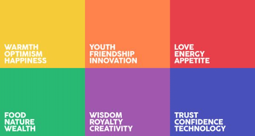
Here’s a breakdown of each color and the emotion it is most commonly associated with:
- Red – passion, excitement, danger
- Orange – happiness, fun
- Yellow – optimism, happiness
- Green – healing, growth, fertility
- Blue – trustworthiness, reliability
- Purple – creativity, luxury
- Black – power, sophistication
- White – purity, cleanliness

How Does Color Psychology Work?
So, now that we know what color psychology is, let’s take a look at how it works. How do colors affect our emotions and moods?
Well, it all has to do with the way that our brains process information. Our brains are constantly taking in information from our environment and trying to make sense of it.
When we see a color, our brain will automatically associate it with certain emotions and concepts. Remember the iconic HAL 9000 deactivation scene in Stanley Kubrick’s 2001: A Space Odyssey? The color red there emphasizes how dire the situation is.

Photo from The Wire
The same is true for websites or other marketing elements. When someone visits your website, their brain will automatically start associating the colors that they see with certain emotions and concepts.
Take a look at this example from Grosse Lanterne’s website:

Photo from Awwwards
The colors it uses on its website are dominated by dark imperial blue and emerald green.
The combination of the two colors creates a clean and refreshing palette and conveys a calm and reliable image– which all makes sense as the Grosse Lanterne itself is a three-day music festival that takes place in the forest.
Why Does Color Matter in Business Marketing?
You might be wondering why you should even care about the psychology of colors when it comes to marketing, whether it’s offline marketing campaigns or digital marketing campaigns.
After all, if people are going to react differently to different colors, won’t your marketing efforts just be a shot in the dark?
Actually, no. Understanding color psychology can help you create more effective marketing campaigns. By choosing colors that evoke positive emotions, you can create a more positive impression of your brand.
Research shows that the proper use of color increases brand recognition by 80%. It also raises the visual appearance by 93%. A further 85% of consumers buy because of color.
Through the choice of color in logos, packaging, signage, and advertising, your business can also influence consumers to buy on impulse, or choose their product or service over a competitor’s.
On the other hand, using the wrong colors in your marketing can actually hurt your business.
For example, if you’re selling products that are meant to be calming and relaxing (think: aromatherapy), using a color like red is going to create the wrong impression.
How to Use Color Psychology in Your Business
Now that we know all about the psychology of colors, let’s take a look at how you can use it to your advantage in marketing.
As we mentioned before, it’s important to choose colors that will create the right impression with your target audience. This way, you can create more effective marketing campaigns that increase conversions and sales.
Here are a few tips to help you get started:
#1. Know Your Target Audience
The first step is to understand who your target audience is. It’s crucial as it will help you determine which colors will work best for your business.
If you’re targeting young adults, you might want to use more energetic and vibrant colors. On the other hand, if you’re targeting seniors, you might want to use more subdued and calming colors.
So, make sure you ask yourself questions like, “what emotions do I want to evoke in my target audiences?” and “what kind of impression do I want to make?”
Once you know the answers to these questions, you’ll be able to choose colors that will create the right impression.
#2. Choose Colors that Match Your Brand Identity
It’s not all about your target audiences, though. You also need to make sure that the colors you choose match your brand identity.
After all, you don’t want to use a color that clashes with your branding. This will only create confusion and make it difficult for people to remember your brand.
So, before you start choosing colors, take some time to think about your brand identity. What are the colors that represent your company and reflect your brand’s values and personality?
For example, if your brand is fun and playful, you might want to use bright colors like orange or yellow. If your brand is more professional and serious, you might want to use darker colors like blue or purple.
Here’s an example from one of the most-used blockchain games, Axie Infinity. They use sky blue color dominantly on their website as it represents their branding color.

Photo from axieinfinity.com
#3. Create a Consistent Color Palette
Once you’ve chosen the right colors for your business, it’s important to create a color palette.
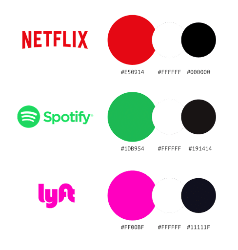
This will help you keep your branding consistent across all of your marketing materials and help your target audience recognize your brand and make a positive association with it.

Photo from Venngage
By creating a consistent color palette, you’ll also be able to create a more unified brand identity that will resonate with your target audience.
To do this, you’ll need to use the same colors across all of your marketing materials. This includes your website, social media accounts, business cards, and marketing proposals.
#4. Be Careful with Contrast
While contrasting colors can be eye-catching, it’s important to use them sparingly. If you use too many contrasting colors, your marketing will look chaotic and unprofessional.
Instead, try to stick to two or three complementary colors. This will create a more cohesive design that looks professional and polished.
Also, be sure to use light colors on dark backgrounds and dark colors on light backgrounds. This will create the most visual contrast and draw attention to your marketing materials.
Here’s an example from Golf Space that combines dark with light colors to create a neat, professional look for their website design. Bright yellow-green color is also used to make crucial CTAs pop up and more noticeable.

Photo from Designshack
#5. Pay Attention to Your Competitors
It’s also important to pay attention to your competitors and what colors they’re using in their marketing. It’s always best to use different colors than your competitors so you can stand out from the crowd.
In other words, using different colors from your competitors will help you create a more unique and recognizable brand.
But, of course, this doesn’t mean that you should always avoid using the same colors as your competitors altogether.
In fact, using similar colors can actually help create a sense of unity and solidarity among businesses in the same industry.
If you’re not sure what colors your competitors are using, take a look at their websites and social media accounts.
This will give you a good idea of the colors they’re mostly using and how you can use them to your advantage.
#6. Test Different Colors
Finally, don’t forget to test your marketing materials before you launch your campaign.
Remember that color psychology is not an exact science. What works for one business might not work for another.
That’s why it’s important to test different colors to see what works best for you. See how people react to different colors and make adjustments accordingly.
One way to do this is to create different versions of your marketing materials (e.g., a Facebook ad, an email campaign, etc.) and use different colors for each one. Then, track the results to see which colors are more effective.
You can also use A/B testing to test different colors on your website. For example, you could test different color schemes for your call-to-action buttons and see which one gets more clicks.
The Bottom Line
Brands don’t use color for the sake of aesthetics, there is always a strategy and a reason for the colors used in marketing. Different colors can create different emotions in people, leading to certain actions or none at all.
By understanding how colors affect our emotions, you can choose colors that will create the right impression with your target audience. This, in turn, can help you increase conversions and sales.
Author’s Bio

Andre Oentoro is the founder of Breadnbeyond, an award-winning explainer video company. He helps businesses increase conversion rates, close more sales, and get positive ROI from explainer videos (in that order).


