
In modern marketing, individuals use factual data in their businesses and organizations. The data is then analyzed so that people can make data-driven decisions for their organizations.
This is where data visualization techniques are essential.
Data visualization is the technique of creating graphical representations that contain the information and the data. Visualization techniques enable accessible communication and interpretation of data hence one can conclude.
Excel and Google sheets data visualization allow you to load different data sets. You can choose a data visualization technique that works for you.
From research conducted, it was confirmed that 86% of businesses believe data visualization is essential for marketing. The study found that companies used visuals to improve marketing strategy in 2020-2021 and beyond.
You need to know how data visualization techniques work for your organization to thrive and attract clients, especially when creating your business proposals. This is because different types of data require a specific data visualization technique.
You can interpret and analyze data using a proper marketing visualization technique. This gives you a deeper understanding of your data hence enabling decision-making.
From recent studies, it was established that individuals use cognitive resources in data visualization. Out of 19% of the individuals, 4.5% can compare data using data visualization techniques (Source: “Can images stop data overload?”)
There are many different data visualization techniques one can use to visualize data.
This blog will provide some crucial data visualization techniques relevant to marketing.
Data Visualization Techniques
Data visualization techniques help an individual make data-driven decisions, increase a business’s potential and improve confidence in marketing.
Visualization in Excel and Google sheets has provided users with multiple data visualization techniques.
Below are some data visualization techniques you can use in effectively presenting and interpreting your data.
The type of data visualization you choose will depend on your working data.
Some of the data visualization techniques include;
- Charts
- Maps
- Diagrams and matrices
- Excel and Google Sheets
Charts
In data visualization techniques, charts and graphs are the commonly used techniques.
Charts are graphical representations of an individual’s data. This data visualization technique uses symbols to enhance understanding and proper interpretation of the data.
Charts and graphs modify large volumes of data into understandable and consequential visuals.
Examples of charts and graphs in data visualization include;
- Bar chart
- Pie chart
- Line chart
- Area chart
- Word cloud chart
- Sankey diagram
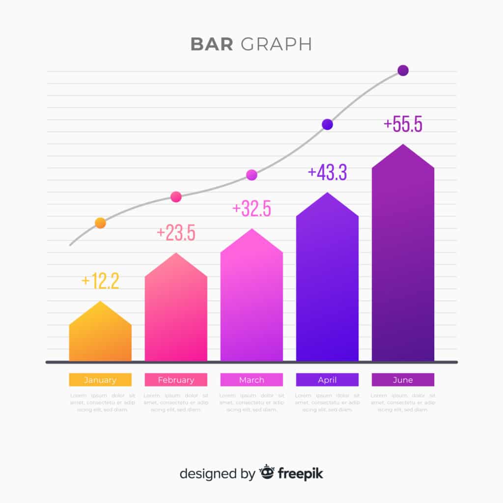
1. Bar charts
Bar charts compare data visualization data and highlight the data to be analyzed. These charts are data visualization techniques that are popular and easy to use. One axis shows different categories being compared, while the other shows a measured value.
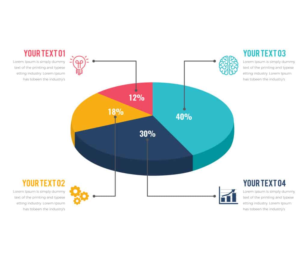
2. Pie charts
This data visualization technique is widely used in fields where data is collected and needs analysis. These charts represent the number of various classifications and easier data comparison.
If you’re handling many data series, pie charts may not be very suitable. This is because each slice decreases as the series of data increases.
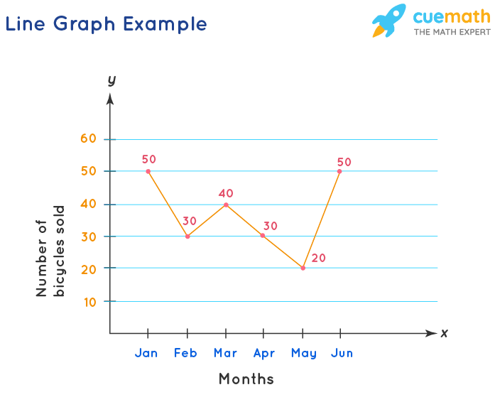
3. Line chart
In this kind of chart, a constant time frame on how data changes are shown gradually. The line chart reflects various shifts at a given time over your data.
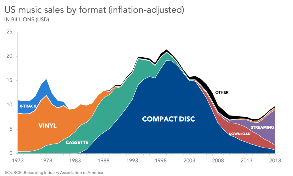
4. Area chart
In data visualization, area charts should have certain transparency. This enables the user to observe, interpret and analyze the intersecting correlation between a data series.
5. Word cloud chart
This is a data visualization technique that is used to represent text data. It is a graphic visualization that contains vocabulary. Word cloud charts exhibit a large amount of text data and can be quickly interpreted by users.

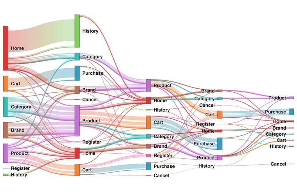
6. Sankey diagram
These data visualization types expound on different data sets using a diagrammatic data flow view. Nodes allow data organization systematically, enabling more straightforward interpretation and efficient data visualization.
The Sankey diagram consists of vertical columns and horizontal flow. The user is quickly able to read across the data in flow. Therefore with this data visualization technique, you can read through your data hence proper decision making.
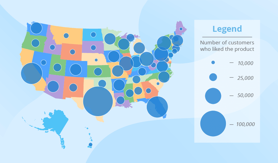
Maps
In data visualization, the use of maps is based on the amount of data to be analyzed. Maps enable you to have a rundown of data. Maps in data visualization are used to analyze and display data geographically.
With maps, you can know data distribution and how to visualize it. Maps also enable you to do proper organization, analysis, and easy understanding of large amounts of data.
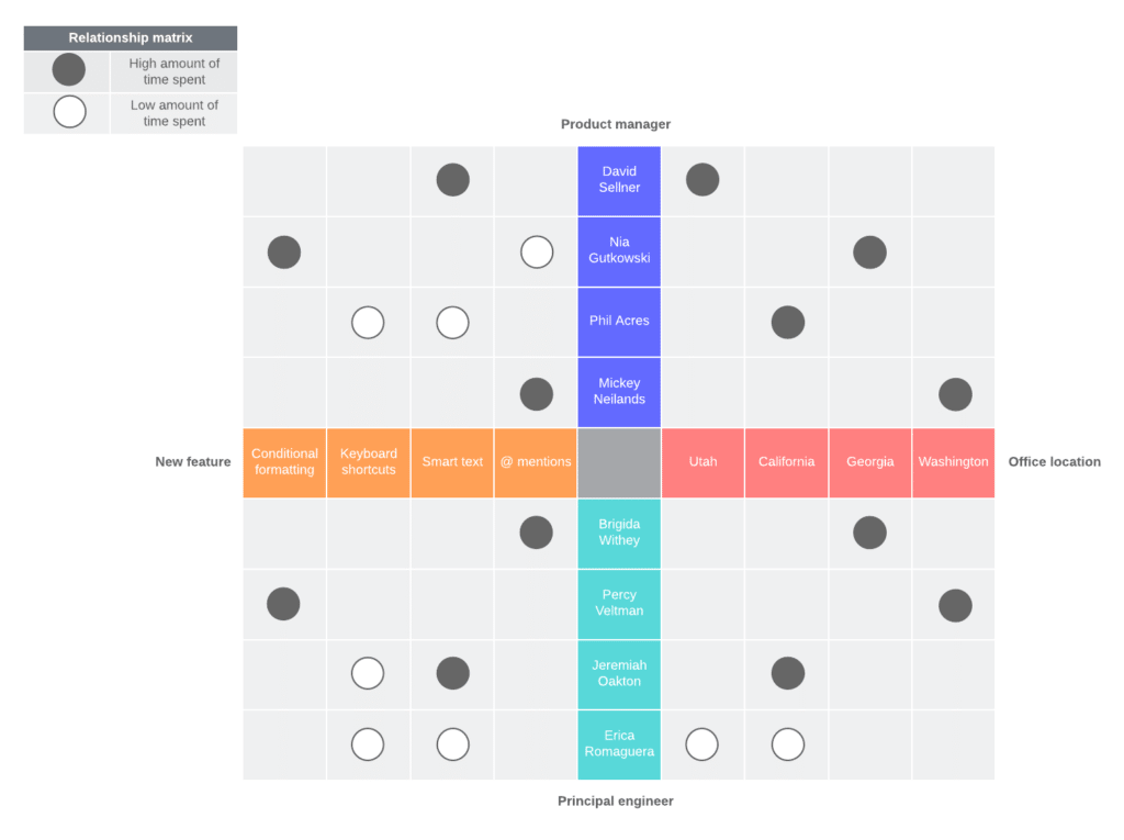
Diagrams and matrices
Diagrams and matrices are chosen in data visualization depending on the type of data being analyzed. Diagrams and matrices are data visualization techniques that display and explore the connection between data sets.
Matrices and diagrams help show the root of a problem hence proper decision making.
Visualization in Excel and Google sheets
Data visualization in Excel and Google sheets in modern marketing is critical. Excel and Google sheets are great tools for any organization to draw data-driven decisions.
Visualization in Excel and Google sheets provides the user with different data visualization techniques. This will help to analyze and interpret data easily.
Visualization in Excel and Google sheets gives you flexibility while generating a series of data. Presenting data visualization in Excel and Google sheets is a convenient and easy interpretation.
Wrap up
Data visualization techniques are part of our day-to-day lives. In one way or the other, we have all come across data visualization. This is either while scrolling your phone, watching television, or reading a newspaper. In marketing, you need a data visualization technique that will help you analyze and interpret data easily.
Data visualization will help you reach your target audience easily. This will make your data analysis and interpretation easier, leading to proper data-driven decisions.
With data visualization in Excel and Google sheets, you have multiple choices to visualize data.
You don’t have to stress yourself about how to visualize data. You are fully sorted in data visualization with bars, charts, maps, tables, diagrams, and matrices.


