For businesses with any online presence, website landing pages play an essential role. Quite often, they’re the first things new visitors see when they come across your website. But how effective they are depends on a lot of different factors. From aesthetic presentation to menu optimization, it’s easy to make mistakes that aren’t readily apparent.
And, even if a web page seems like it’s doing fine, that doesn’t mean it can’t be improved. Or even just given a visual refresh to catch the eye. But it can be hard to know where to begin. So, we made this guide on how to optimize a landing page for lead generation.
What is a landing page?
Simply put, a landing page is the page someone lands on when searching for a specific product or clicking on a marketing campaign. They’re standalone pages designed to promote said campaigns. A landing page aims to convert visitors into leads or sales.
It’s important to make sure your landing page is functioning correctly. If your landing page isn’t functioning properly or optimized, you’ll risk losing out on potential leads and conversions.
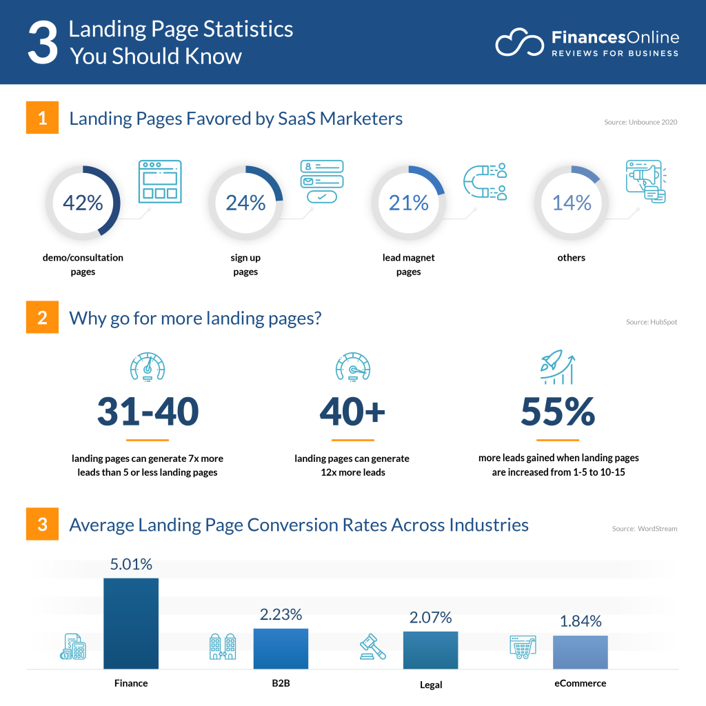
Image sourced from financesonline.com
The importance of landing page optimization
As noted, a website’s landing page is essential for making a first impression. More than that, it’s a key part of your overall digital and content marketing strategy, which is crucial for business success in today’s online landscape.
According to Sytian, a web developer Philippines, a landing page should distill the ethos of your brand product or service while concisely communicating its purpose. It needs to tell people why they should care and why they should engage with your campaign.
Despite the adage warning us not to, most people tend to judge books by their covers. And this applies to virtual products and services, too.
We all have an idea of what a “professional” or “trustworthy” website should look like. Websites that don’t meet these criteria get disregarded as shady and unreliable.
From the moment we follow links or search results, we make experience-based snap judgments. And this is often a matter of aesthetics, such as the color scheme, banners, or the appearance of buttons. These things matter almost as much as actual functionality.
So, as you can see, your website’s landing page does a lot of the heavy lifting in the lead generation process and the initial stages of customer conversion.
How to optimize a landing page for lead generation and increased conversions
With so much pressure on your landing page, it’s important to iron out even the tiniest flaw. These imperfections may not seem significant. However, their cumulative impact can significantly alter the effectiveness of your site.
And if something goes wrong with the basic functionality, existing and would-be customers could flood your support channels. To avoid putting pressure on your inbound call center solutions, it’s better to maintain your landing page proactively and check it works as intended.
Here are some tips on how to optimize a landing page for lead generation and increased conversions.
Craft compelling page headlines
Punchy headlines draw readers in. And they play a key role in how to optimize a landing page for lead generation. When someone visits your landing page, they’ll either navigate away or move to another section of your site.
For the latter to happen, they need to see something interesting to click on—interesting articles, intriguing products, and so on. SEO can really help, even for your landing page, because you know the kinds of terms people will engage with. But it’s also about choosing creative, evocative language that draws the reader in.

Screenshot from Western Rise
Understand your audience
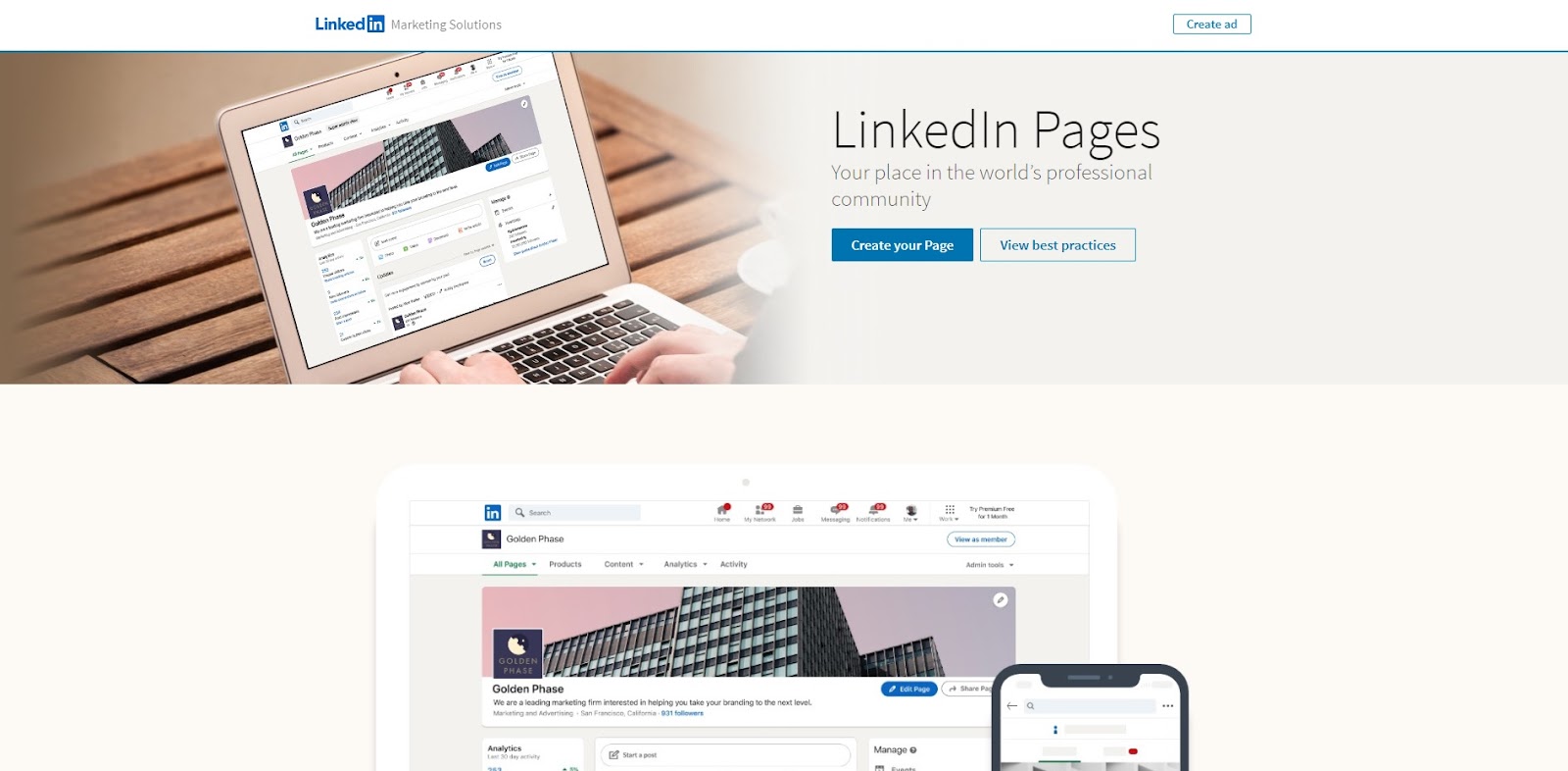
To optimize something means focusing it more effectively toward its specific purpose. Some of these needs are common sense, like basic user-friendliness. But other things you can’t really guess at. This is where customer feedback comes in.
Many landing pages now feature a chatbot or a small feedback survey when a visitor navigates away from the page. You can also recruit testers to navigate your website from the perspective of an average visitor. The resulting information helps you optimize by revealing flaws and concerns that may not be apparent from a web developer’s perspective.
Screenshot from LinkedIn
Establish clear conversion goals and KPIs
Conversion goals and KPIs (Key Performance Indicators) are essential for measuring the success of your landing page. Fortunately, they’re both very easy to understand.
Conversion goals are your aims about how you want visitors to engage with your website. So, a simple example would be getting 60% of landing page visitors to purchase a product. Other conversion goals include:
- Subscribing to a service.
- Submitting a form.
- Creating a profile.
- Clicking a button.
- Sharing content.
- Signing up for a mailing list or content reminder.
A KPI is a quantifiable metric of performance. So, a lot of conversion goals also work as KPIs, like click-through rates, purchases, subscriptions, and content engagement stats. Tracking these will help you measure the success of your landing page and marketing campaign.
Utilize engaging visual elements
We’ve touched on visual elements like color choice and text, but a huge part of how to optimize a landing page for lead generation is creating something engaging. Consider using professionally designed landing page templates to ensure a sleek and effective presentation.
You will need visual elements that draw the reader in and create a particular emotional response. You might choose a white, minimalist backdrop for sleek professionalism, blue to be calm and inviting, or red and black to be bold and exciting. Your company logo should also be prominent, with a website aesthetic that compliments it.
Then, there’s imagery to consider. A cooking website, for example, should include sumptuous food photography on its landing page to whet visitors’ appetites. Or, if it’s the landing page of a holiday deals site, you’ll want pictures of pristine cruise ships and sun-drenched vistas.
Create persuasive and informative content
Interesting content is essential if you want website visitors to explore beyond your landing page. This includes content to persuade them into conversion. Like customer testimonials or blog pieces about the issues your services tackle. One such skill that can help you write persuasive blog pieces is paraphrasing. With the help of paraphrasing, you can turn your simple and bland content into engaging and unique ones. Once you have persuasive, informative content lined up, link back to some of the choice pieces from your landing page.
But it’s also important to educate visitors. Sometimes, the only thing stopping someone from subscribing to your service is the idea that it’s just too complicated. But the right content can address these worries.
For example, a landing page for a telecommunications company could contain an FAQ section answering common questions. These answers can link back to articles like “How to forward a landline call to a cell phone.” These content pieces can also link back to your landing page, helping to increase conversions.
Design user-friendly forms
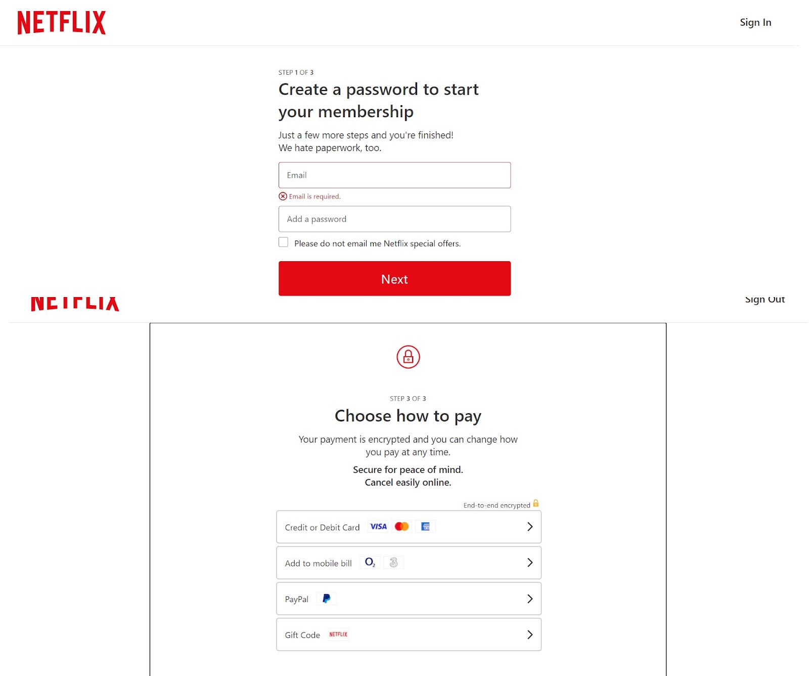
You’d think that once someone starts filling out a form on your site, they’re basically a guaranteed conversion. But that isn’t always the case. People give up on forms for all kinds of reasons.
The information requested might be unclear. They might get distracted, or the form might just be dense and boring. Or they might not be fully committed to their subscription or purchase. Cart abandonment is a common example of this sort of thing.
It’s basic user-friendliness. This is an important part of how to optimize a landing page for lead generation and increased conversions. Forms need clear and concise language to prevent misunderstandings. They also shouldn’t be too long, as each step is another chance for would-be conversions to lose interest.
Screenshot from Netflix
Build trust with social proof
Social proof essentially means brand recognition. When we see a new product or service we don’t recognize, there’s the possibility in our minds that it’s a scam.
But, when we recognize a brand, it creates a measure of trust. We know other people use it, which reduces customer concerns about being taken advantage of. So, how do we highlight social proof for first-time visitors to your landing page?
Customer testimonials and published reviews go a long way towards this. And for B2B services, this can mean highlighting the businesses actively using your products.
Employ a strong call to action (CTA)
If you have high traffic but low conversion rates, your calls to action might not be working effectively. Strong CTAs need good, clear language. But they can also benefit from complementary visuals so that they stand out from the rest of your website.
CTAs invite customers to engage with different parts of your website. These can include evergreen CTAs like prompts to explore your blog or to use your product search function. But it can also include timed CTAs like a promotional sales banner with a button linked to pages of deals and discounts.
Experiment with A/B testing
A/B testing, or split testing, is when you run two different versions of a webpage simultaneously to see which is more effective. This is done by segmenting visitors into groups to determine who sees what page version. So, for example, you could segment users based on geographical region.
American users, then, would continue to see site A (the original, making them the control group). Meanwhile, users in Europe would see the new version (B). At the end, you compare performance stats and feedback to see which worked better. You can even switch the groups to round out your findings.
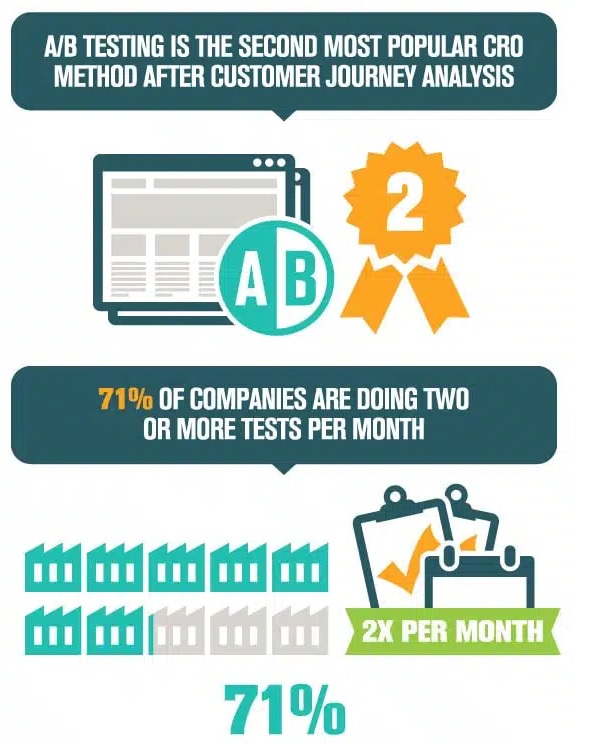
Image sourced from invespcro.com
Your Landing Page is the Lynchpin of Your Website
You need to know how to optimize a landing page for lead generation because it’s what sets the tone for a user’s entire experience. It’s about finding the right balance between aesthetics and functionality.
A good landing page is a distillation of your brand. If it puts people off, they’ll never see even a fraction of what you have to offer. Your menu needs to feel intuitive. Your CTAs need to pop. And people should have a clear idea of what their incentive is to stick around.
So, take what you’ve learned from this guide and create the landing page your online business truly deserves.
